Gift Choice and Redemption Page Best Practices
Occasion shapes gift card anxiety more than brands realize, and the page design should too.

Givers carry two anxieties at once: picking the wrong thing, and spending the wrong amount. Neither is irrational. Gift-giving has real social stakes, and a gift card more than almost any other gift can read as either generous and thoughtful or lazy and impersonal, depending entirely on how it's framed and presented.
Occasion shapes this more than most brands acknowledge. A page that presents a flat denomination selector with no seasonal context feels exactly like a card grabbed at the checkout counter. The giver notices. Not consciously, but they notice.
There's also a generational split worth designing around. Gen X and Boomers index highest for gift card giving, planning them as holiday staples. Meanwhile, roughly half of Gen Z and Millennial consumers said they were more likely to give a personalized gift in 2024 than the year before. These two cohorts want different things from the same page. The older buyer wants simplicity and the quiet confidence that they made a reasonable choice; the younger buyer wants to feel like they did something considered, even if the mechanism is a digital card with a note attached.
What bridges them, oddly, is what researchers call the "found money" effect. Recipients experience gift cards not as a substitute for full-price shopping but as a windfall, money that exists outside their normal budgeting logic. That framing matters for how you position denomination options to the giver, because it means they aren't just transacting. They're initiating an experience the recipient will perceive as genuinely free. There's something worth communicating there, even quietly, in the copy and the visual language of the page.
Personalization appetite is real but uneven. About 36% of buyers prefer personalized gifts, large enough to warrant a clear personalization path, but not large enough to make it the only path. Both routes need to coexist without either one reading as the inferior option.
Making Gift Pages Findable Before Worrying About What's on Them
Most brands skip this conversation entirely and go straight to debating button color. That's backwards.
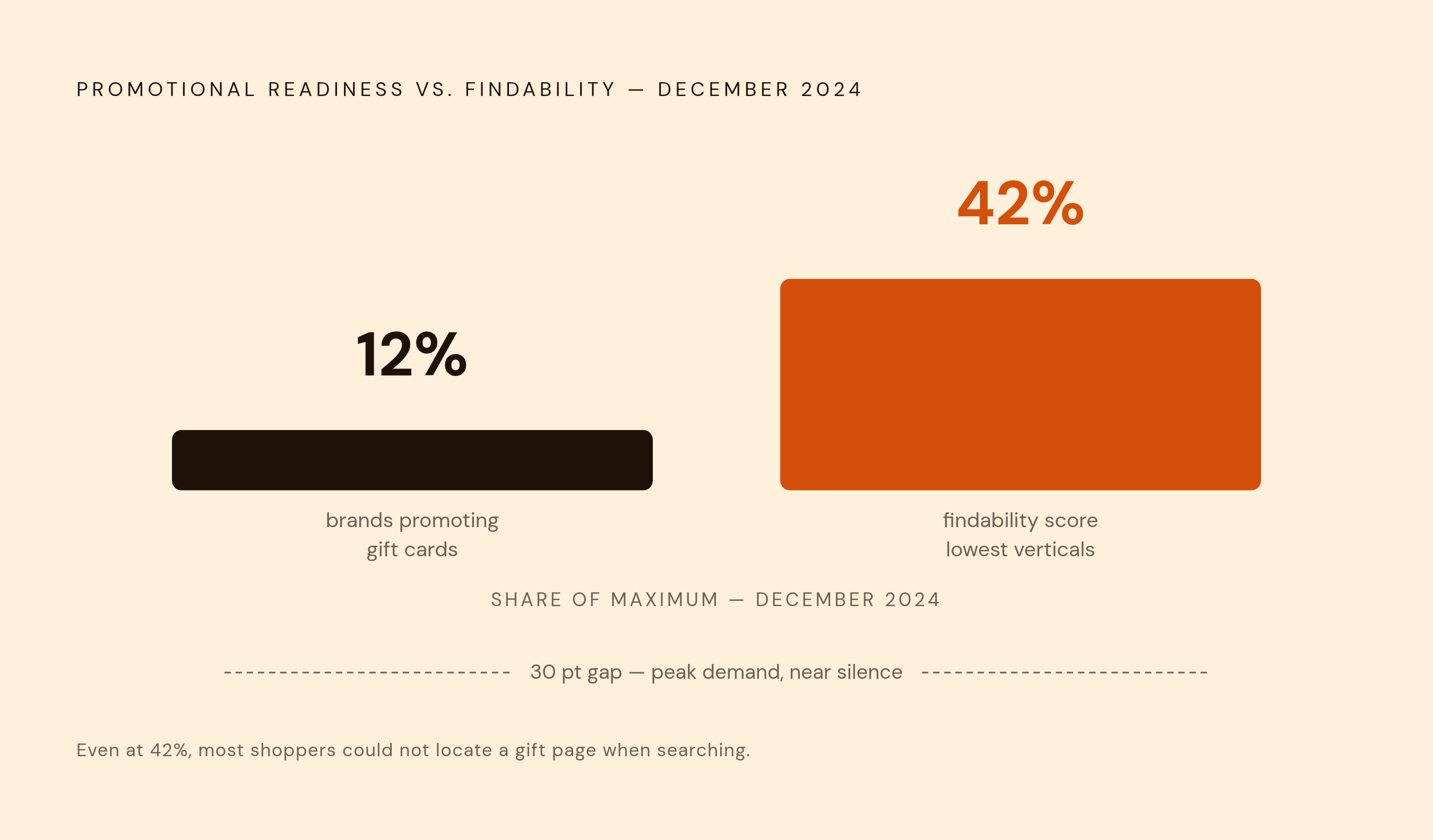
As of December 2024, the lowest-performing verticals in gift card discoverability, travel and entertainment among them, scored just 42% on findability measures. Most givers trying to locate a gift page in those categories couldn't find it even when they were actively looking. You can have a beautifully designed redemption flow and it converts at zero if no one reaches it.
The baseline here is not sophisticated: a dedicated landing page with main-menu placement, a homepage feature during peak seasons, and basic search optimization for terms like "buy gift cards online" or "digital gift cards for birthdays." These are table stakes. And yet only 12% of brands were actively running gift card promotions during December 2024, the single highest-volume gift card purchase period of the year. I don't have a clean explanation for that number other than organizational blind spot. Someone owns the product page. Nobody owns the discoverability problem.
One structural move that consistently outperforms the standard "gift cards" menu silo is integrating gift card options into occasion-based navigation. A giver browsing a "birthday gifts" section should encounter the gift card naturally, because they're not searching for "gift cards." They're searching for a solution to a social obligation. Meet them at the problem, not at the product category.
Everything else in this piece assumes a giver who found the page. If that's not solved first, the rest is academic.
Denomination Display, Denomination Options, and the Visual Presentation of Choice
Once a giver lands on the page, the first decision they face is how much to spend. This is where denomination architecture does quiet, consequential work that most brands underestimate.
Preset amounts reduce decision fatigue. A custom-amount field captures givers with specific budgets or specific intentions. Both belong on the same page, neither buried. But the preset options matter more than brands typically treat them: not $10 to $500 in equal increments, but a curated set anchored around what actually reflects occasion norms. A set of amounts that implicitly signals "this is what people give for graduations" or "this is what people give for birthdays" does emotional work for an anxious giver. It gives them permission.
For promotions with multiple gift options, an image grid transforms what would otherwise be a purely utilitarian transaction into something that reads as a considered selection. Seeing all choices simultaneously lets the giver perceive the decision as generous rather than mechanical. That perception matters more than brands realize, because it affects how givers feel about the gift after they send it, and whether they come back to use the page again.
The format question, digital versus physical, deserves direct treatment rather than being quietly defaulted to digital. Digital cards serve last-minute buyers and skew younger; that's where most volume is going. But physical cards with premium packaging carry tactile weight that digital can't replicate, and there are occasions where that weight is the point. Offering both, where operationally feasible, isn't redundancy. It's serving different moments.
One mechanic worth noting: setting a free-shipping threshold $20 to $30 above common denomination values nudges givers toward a slightly higher denomination, or motivates recipients to overspend at redemption. It requires no persuasion copy. It just sits there and does its work.
Personalization Options That Add Meaning Without Adding Steps
The core tension in personalization design is genuine: every additional field is a potential abandonment trigger, but personalization increases both perceived value and downstream redemption rates. The goal isn't maximum personalization. It's the right amount, with minimum friction.
In practice, minimum viable personalization covers four things: recipient name, a short personal message, a choice of card design, and a scheduled delivery date. Four elements, done well, cover most of what givers emotionally want to accomplish. They want the recipient to know it came from them, to feel something when it arrives, and to receive it at the right moment. That's it.
Visual design selection should function as an image grid with a single click to select, not a dropdown, not a carousel hiding half the options behind a navigation arrow. Givers should see their choices simultaneously and make one decision. Anything requiring more navigation than that introduces friction without adding value, and friction at the personalization step is particularly costly because it's the step where the giver is most emotionally invested.
The emerging layer here is AI-assisted gifting. Etsy's Gift Mode, launched in 2024, illustrates the direction: describe your recipient in natural language, get surfaced personas and contextually appropriate suggestions. The mechanic works because it addresses the giver's core anxiety, fear of choosing wrong, in the exact vocabulary of the decision they're already making. It's not a gimmick. It's answering the right question.
The commercial case for personalization investment isn't just experiential. McKinsey's 2024 research found meaningful revenue uplift from personalization in e-commerce contexts, and Salesforce's State of the Connected Customer data found that 71% of consumers now expect personalized experiences, with 76% expressing frustration when they don't get them. Expectation has become the baseline. Falling short of it doesn't read as neutral; it reads as indifference.
What the Recipient Encounters When They Arrive to Redeem
The recipient arrives in a fundamentally different psychological state than the giver did. They know exactly how much they have. They likely have no prior relationship with the brand. And they are acutely sensitive to anything that erodes the card's stated value, because they are mentally budgeting against a fixed number that they've already incorporated as theirs.
This is the endowment effect operating in full force. Recipients have psychologically claimed the card balance before they've spent a cent of it. Loss aversion, which research consistently shows to be more motivationally potent than equivalent gain, makes any surprise cost register not as an inconvenience but as a theft. They arrived thinking they had $50. Discovering a $7.95 shipping charge at checkout doesn't just irritate them; it violates their mental model of what they owned.
Nielsen Norman Group's standard guidance on fee disclosure, show shipping, handling, taxes, and fees before requesting personal information, applies here with unusual force. For gift card recipients specifically, a late fee revelation isn't a UX misstep. It's a trust breach from a brand they didn't choose and haven't yet decided to trust.
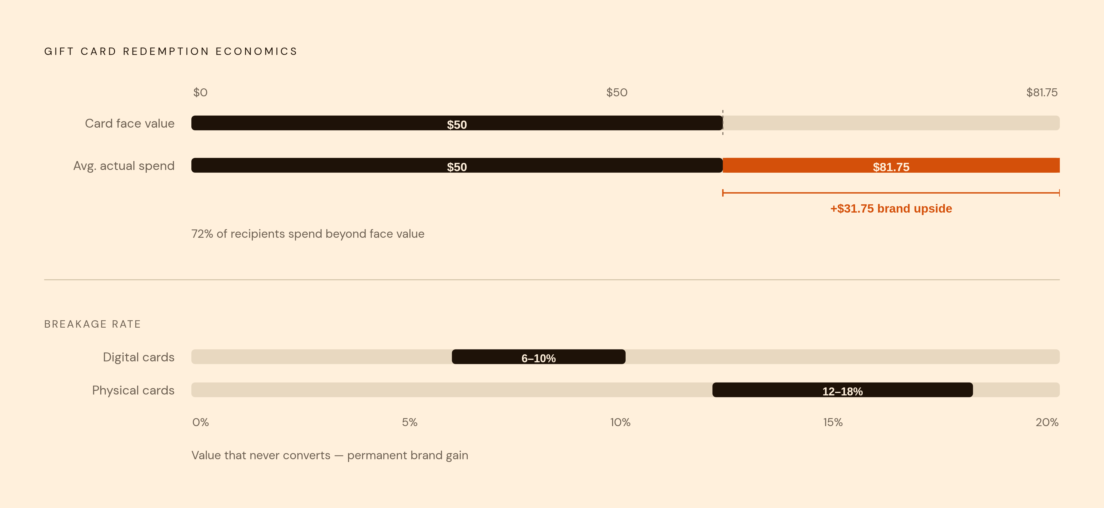
Here's what makes this commercially interesting rather than just ethically obvious: about 72% of gift card recipients spend more than the card's face value during redemption, exceeding it by an average of $31.75. Overspend is the norm, not the exception, when friction is low enough to let it happen. The design goal for a recipient-facing redemption experience isn't recovery from the original gift card purchase. It's facilitating a first purchase by a newly introduced customer who is already predisposed to spend more than they have. That's an unusually good situation for a brand to be in. The question is whether the page is built to take advantage of it.
The Redemption Field Itself: Placement, Labeling, and What Goes Wrong
The single most common structural error in gift card redemption flows is placing the redemption field adjacent to, or visually similar to, the credit card payment field. This sounds almost too obvious to flag until you notice how frequently it happens in the wild. Proximity causes wrong entries, failed transactions, confused recipients, and abandonment from users who don't understand what went wrong or what to do about it.
The visual and copy distinction between "apply gift card" and "enter payment method" is not negotiable. These are not competing options for the same action. They should not share visual hierarchy, proximity, or styling. They should not appear to be asking for the same type of information at the same moment in the flow. I've watched users type a gift card code into the credit card number field, get rejected, and close the tab. Not because they were confused, but because the page gave them no reason to know the difference.
Placement matters as much as visual design. The redemption field should be accessible at every relevant subpage of the checkout flow, not buried on a single step a recipient might skip past. A recipient who can't find where to enter their code has already started losing trust before making a single purchase decision.
Gift card codes should be copyable to clipboard in one click, and the delivery email should include a direct link to the cart or storefront. Manual transcription of long alphanumeric codes is a friction point that has no defensible justification in 2024. QR code redemption eliminates it entirely for mobile users.
Minimum order requirements deserve particular attention. If they exist, they need to appear explicitly and early, not as an error message after a recipient has built a cart. Discovering a minimum order threshold after you've spent time selecting products is a specific kind of betrayal. It feels designed to frustrate, and recipients don't forget it.
Account Creation, Mobile Usability, and the Other Friction Points That Quietly Kill Redemption
Requiring account creation before redemption is a hard stop. The recipient has no prior relationship with the brand. They didn't choose it. Asking them to create an account before they've had a single positive interaction with the product is asking them to invest in a relationship they haven't yet decided they want. The best practice here is unambiguous: no forced account creation for redemption.
The mobile dimension is not optional or secondary. Over 70% of gift voucher purchases now occur on mobile devices, which means the redemption experience that follows is likely also happening on a phone. A flow unoptimized for smaller screens is failing the majority of its users, not an edge case.
Mobile best practices for redemption converge on a few concrete things: single-transaction checkout that bundles gift card and merchandise without requiring navigation between separate flows, Apple Pay and Google Pay support to eliminate manual payment entry, and tap-friendly field sizing that doesn't require surgical precision to activate. Balance display should update dynamically as items are added to the cart. A recipient should never be required to do arithmetic to understand whether their card covers their order. That calculation belongs to the brand.
Partial redemption support is absent far more often than it should be. Blocking a recipient from splitting an order between a gift card and a second payment method forces them into an impossible choice: spend exactly the right amount, or don't redeem at all. Neither outcome benefits the brand. The Starbucks model, treating the card balance as a debit account rather than a promotional code, is the conceptual frame worth borrowing. It makes redemption feel like spending your own money, because psychologically, for the recipient, it is.
Error Handling and What Happens When Redemption Goes Wrong
Failure states are not edge cases. They happen often enough to deserve the same design rigor as the primary flow, and they almost never get it.
The common failure modes are predictable: invalid code, expired card, already-redeemed balance, minimum order not met, technical lookup error. Each needs a specific, plain-language message. "This code is invalid" is usable. "Error 403" is not. The gap between those two responses is the gap between a frustrated user who tries again and one who closes the tab and calls the whole thing a wash.
For expired or zero-balance cards, the error message carries a particular obligation. It should explain what happened, not just report a status. And it should provide a concrete path forward: a support contact, a balance lookup tool, an explanation of what the user can do next. A dead end at an error state is a brand abandonment event, and the user will associate that feeling with the brand, not with the technology that failed them.
A standalone balance lookup tool, accessible before the user enters checkout, meaningfully reduces what I'd call redemption anxiety. A recipient who knows their balance before they start shopping can build a cart with confidence. That confidence, given what the overspend data shows, translates directly into purchase behavior.
One thing worth naming plainly: digital cards run a breakage rate of roughly 6 to 10%; physical cards run 12 to 18%. The gap is largely attributable to friction, physical loss, forgetting, difficulty of use. Some of that friction is unavoidable. Some of it is not. Deliberately confusing redemption flows that manufacture breakage are a real thing, and they produce short-term revenue gains that are measurable and reputationally corrosive. The 20% of people who have had a gift card expire before redeeming aren't anomalies. They remember, and they do not return.
What Recipients Do After They Redeem, and How the Page Influences It
The redemption moment is the brand's best opportunity to meet a customer who didn't choose them. That sounds like it should be a disadvantage. It usually isn't. The recipient arrives without negative prior experience, with money already committed to spending, and with the psychological momentum of a gift to enjoy. The page's job is to not squander that opening.
Practical merchandising at the redemption entry point should do two things simultaneously: reduce decision burden and introduce the brand's strongest products. Surfacing bestsellers prominently when someone enters with a gift card, and positioning free-shipping thresholds just above common denomination values, motivates the first overspend without requiring persuasion copy. The structure does the work.
Customers who return after an initial gift card redemption are measurably more likely to make an additional purchase and spend more than average on subsequent visits. The return visit has commercial value independent of the original gift. That value begins, specifically, with whether the first redemption experience felt like the brand was working with them or against them.
The post-redemption email is the most underused touchpoint in this entire sequence. Confirmation of successful redemption, remaining balance if partial, and a contextual introduction to the loyalty program or a next-purchase incentive belong in the same email, delivered at the moment of highest attention a new-to-brand recipient will ever have. If that email arrives as a bare order confirmation, the moment is already gone.
What no page can do is guarantee a second visit. That depends on whether the product delivered, whether the packaging felt right, whether the delivery was accurate. The redemption experience creates the conditions for a relationship. Everything after that is on the product itself.